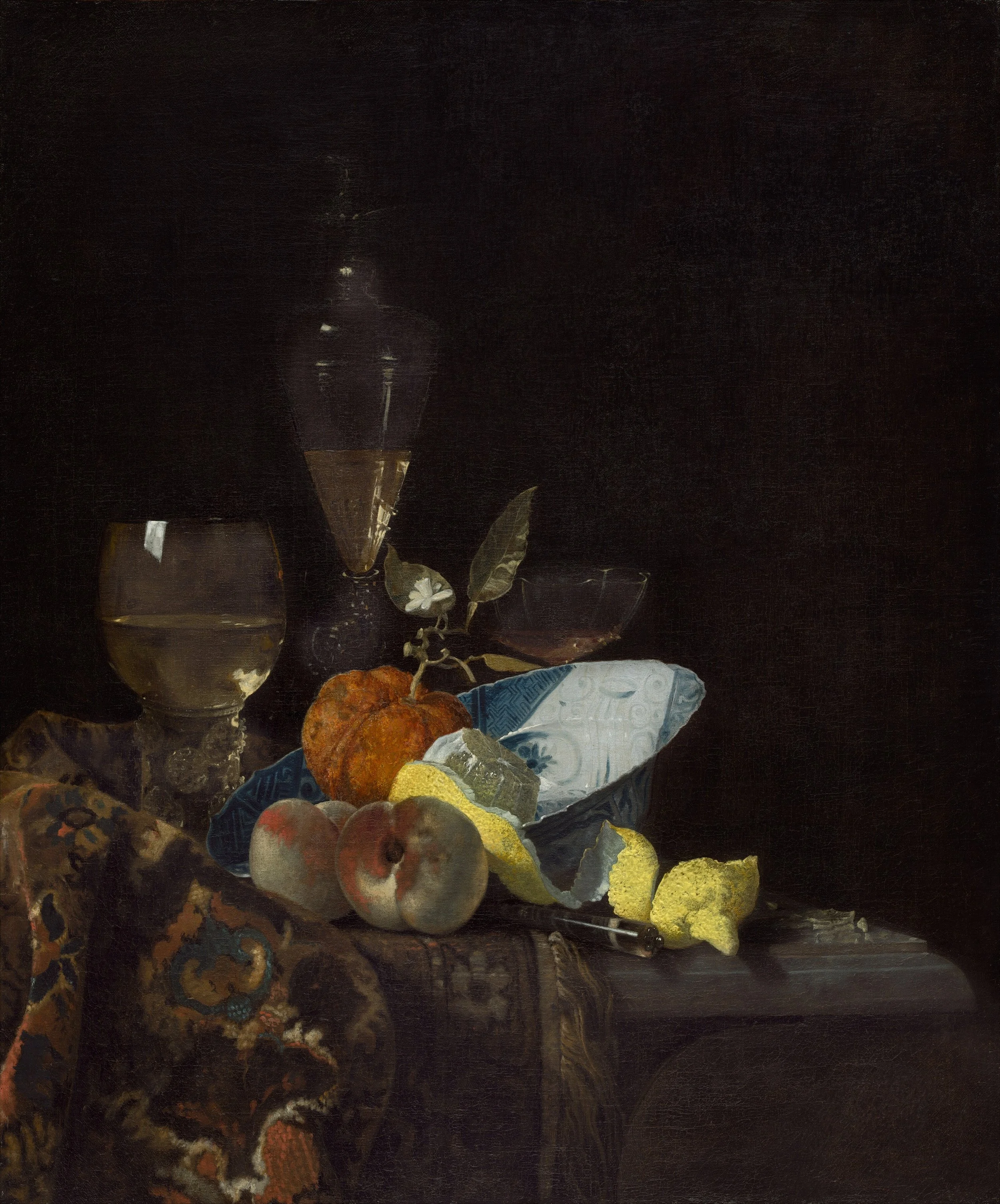
Still Life, by Willem Kalf
Whether a painting succeeds is largely a function of its value composition, the way that values are organized on the picture plane. Drawing from the works of the Old Masters, this post looks at two important ways that value contributes to a work of art. (1) Value can help an artist achieve a sense of dimensionality and depth in their work. Consider that value alone, through the careful use of light and shadow, allows an artist to transform a circle into a sphere. (2) Value—or, more precisely, the right organization and balance of values— also creates a sense of visual interest in an artwork. The works of art that capture our attention are often those with a dramatic value scheme. For the purposes of this post, I will focus my attention upon painting. But the lessons here apply to other two-dimensional art forms as well, including charcoal, graphite, and pastel.
(1) Accurate Values: Creating Depth and Dimensionality in a Painting
Experienced painters often observe that value is significantly more important than color in a painting. Even if your color scheme fails, you can create a successful painting if your value relationships are accurate. To be sure, accurate values do not guarantee a convincing painting, but they help to establish depth and the illusion of three-dimensional form. In portraiture, accurate values allow the painter to capture the three-dimensionality of the human head. A portrait that uses inaccurate or unconventional colors can be believable if its value relationships are correct. But the reverse is not true: the right colors cannot save or render believable a portrait with inaccurate values.
Modeling Form Through Chiaroscuro
Many of the old masters used chiaroscuro in their paintings. Moving from dark to light, (from scuro, “dark” to chiaro “light,” in Italian), they represented changes of value in objects, or throughout a scene, to model three-dimensional form. Leonardo da Vinci believed that modeling form through value is the painter’s primary objective. In A Treatise on Painting, he writes,
The first object of a painter is to make a simple flat surface appear like a relievo, and some of its parts detached from the ground; he who excels all others in that apart of the art, deserves the greatest praise. This perfection of the art depends on the correct distribution of lights and shadows, called Chairo-scuro. If the painter, then, avoids shadows, he may be said to avoid the glory of the art, and to render his work despicable to real connoisseurs, for the sake of acquiring the esteem of vulgar and ignorant admirers of fine colours, who never have any knowledge of relievo.
While colors are pretty, and may attract the attention of the “vulgar,” a skilled painter knows that they take a backseat to value and the modeling of form.
The term ‘chairoscuro’ is sometimes reserved for instances in which the contrast between light and dark is especially dramatic, as in the work of Rembrandt Harmenszoon van Rijn and Michelangelo Merisi Caravaggio. Consider, for example, Rembrandt’s Portrait of an Old Man. Although Rembrandt was working with a very limited palette by our standards today, he was able to capture the dimensionality of the skull through his use of value. The dark value in the background recedes and the side of the sitter’s face melds into it. (More on this below.) The dark value below the brow bone indicates how the eyeballs sit within the sockets, shaded by the brow bone. In contrast, the nose and forehead project forward in space as suggested by the light values; the nose sits slightly in front of the forehead as indicated by the highlight on the nose, which appears to be the lightest light on his face.
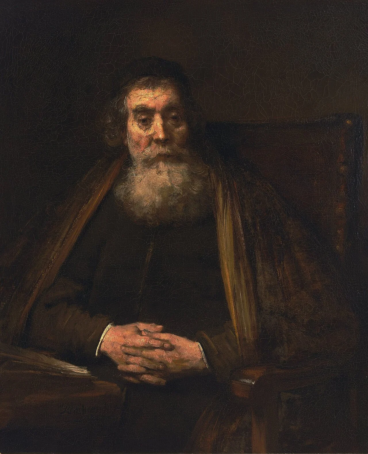
Portrait of an Old Man, by Rembrandt
The same general principles apply to other genres as well, landscape, still life, etc. No matter what one depicts, correct values help to create the illusion of three-dimensional form in painting. In this still life by Willem Claesz Heda, you can see how value relationships contribute to the illusion of form. This is especially clear in the case of the fabric which is of one unified (local) color. The variations of value capture the folds in the fabric and give it a sense of mass. The light on its surface also suggests the fabric’s texture; we can imagine what it would feel like to touch. We see how this plays out in other objects as well, such as the silver ewer; the relationships between light and shadow on the object’s surface prompt us to read it as three-dimensional object that takes up space on the tabletop.
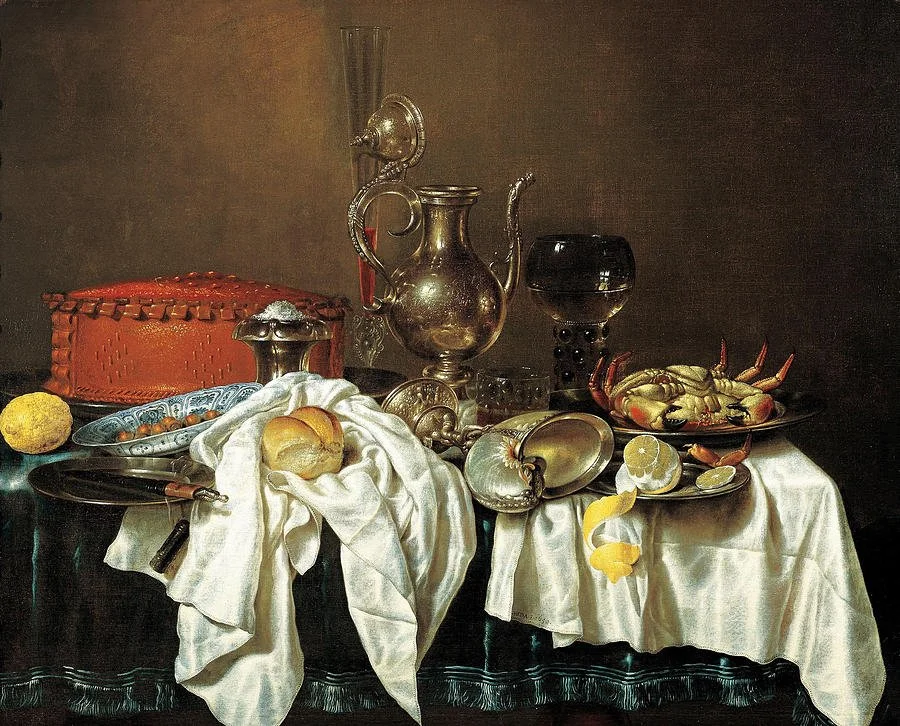
Still Life with Pie and Silver, by William Claesz Heda
Aerial Perspective and Implied Distance
In landscape painting, value relationships play an important role in creating the illusion of distance. Objects that are closer to the viewer are typically darker, warmer, and more clearly defined. As they recede into the distance, they become lighter, cooler, and hazier. Although the Mona Lisa is a portrait, we can see how some of these principles play out in its background. Da Vinci made use of aerial (or atmospheric) perspective in the painting, which refers to the way that the atmosphere affects our perception of objects as they recede in space. The mountains and trees behind the figure become lighter, blurrier, and bluer as they receded into the distance. Although earlier painters had utilized aerial perspective in their work, Da Vinci explained and formalized the concept in his A Treatise on Painting, where writes:
There is another kind of perspective, called aerial, because by the difference of the air it is easy to determine the distance of different objects, though seen on the same line; such, for instance, as buildings behind a wall, and appearing all of the same height above it. If in your picture you want to have one appear more distant than another, you must first suppose the air somewhat thick, because, as we have said before, in such a kind of air the objects seen at great distance, as mountains are, appear bluish like the air, by means of the great quantity of air that interposes between the eye and such mountains.
He goes on to explain how each building will become bluer and less distinct in direct proportion to its distance from the viewer on account of the interposing “thick” air.
(2) Value Control: Creating Visual Interest in a Painting
In addition to making your work believable, the arrangement of values on the surface can make or break your painting in terms of visual interest. Paintings that grab and hold our attention are often those in which lights and darks are arranged in a thoughtful way. A commonly recited “rule” in art circles is that your painting should be 75% dark and 25% light, or 75% light and 25%. The intention here is not to provide a precise quantification of the ratio of light to dark in the ideal painting, but a general guideline or rule of thumb. Most compelling paintings will be organized in roughly this way; they will avoid a 50/50 ratio of light to dark, which would likely be perceived as boring.
Tenebrism and Theatrical Lighting
Notice how Caravaggio has organized lights and darks in The Calling of St. Matthew:
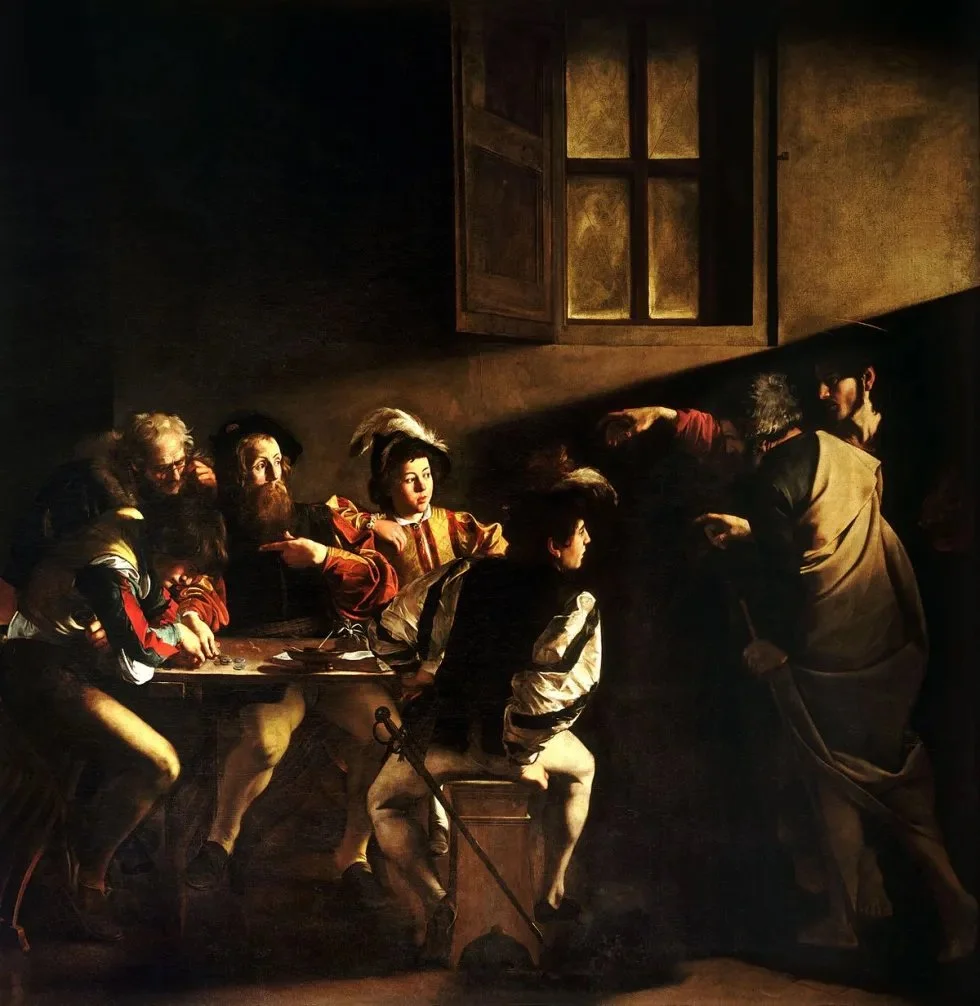
The Calling of St. Matthew, by Michaelangelo Merisi da Caravaggio
The painting is so captivating because of the pattern of light that Caravaggio has constructed amidst the darkness. The light travels through the painting from a single light source, carrying the viewer’s eye with it. In developing the composition of the piece, Caravaggio thought in terms of value, not just objects or figures to be arranged on the picture plane. Indeed, value played an especially important role in his work. Caravaggio is known for his tenebrism, or extreme contrast between darks and lights in his paintings, an especially theatrical form of chiaroscuro. His figures appear to emerge from darkness, often in an enclosed space with a ceiling lamp, which serves as a kind of spotlight. This quality of his work—his use of tenebrism—is largely responsible for its dramatic appearance and feeling. Importantly, the drama here is not all on the surface; instead, his tenebrism accentuates the deeper emotion and psychological themes that he explores in his work as well.
Artemesia Gentileschi, who was influenced by Caravaggio, also used tenebrism in her work to great effect; it intensifies the impact of her work and its message. Consider, for example, her iconic work, Judith Beheading Holofernes, which, at the title suggests, is a depiction of Judith’s beheading of Holofernes, as recounted in the Old Testament. By killing the Assyrian general, Holofernes, the heroic Judith was able to free the people of Israel from the siege by Nebuchadnezzar’s army. The painting is thematically dramatic and presents the act in all its gory detail. But Gentileschi’s use of tenebrism heightens the theatricality of the scene. She sets her brightly illuminated figures against an intensely and uniformly dark background:
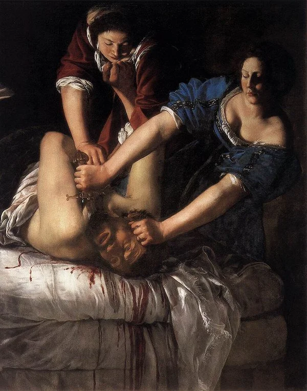
Judith Slaying Holofernes, by Artemisia Gentileschi
Beyond its surface meaning, many art historians interpret the painting as signifying or expressing something more personal to Gentileschi. Some take it to represent Gentileschi’s revenge upon her rapist, painter, Agostino Tassi. Others view it as an expression of her strength and determination as woman painter working within a male-dominated artworld—an artworld that often thwarted her efforts and dismissed her artistic ability. However we interpret the piece, it’s clear that Gentileschi’s mastery of value—her skillful use of tenebrism—enhances the expressive power of her work. Judith Beheading Holofernes would not have the same visual and psychological impact were it instead painted with mid-range values and less contrast.
Caravaggio’s dramatic use of value not only influenced Gentileschi, as well as other ‘Caravaggists’ of his time, but contemporary artists across genres as well. As Andrew Graham-Dixon notes, Caravaggio’s understanding and use of value and light has influenced cinematographers and film makers, such as Pier Paolo Pasolini and Martin Scorsese. Indeed, Graham-Dixon refers to him as a pioneer of modern cinematography. He has had just as much, if not more, influence upon photographers and cinematographers than on contemporary painters (441). In discussing the influence that Caravaggio has had on his filmmaking, Scorsese explains:
I was instantly taken by the power of the pictures, the power of the compositions, the action in the frames, the way he designed the composition and the subject matter…there was no doubt it could be taken into cinema because of the use of light and shadow, the chiaroscuro effect…
Initially I related to the paintings because of the moment that he chose to illuminate the story. The Conversation of Paul, Judith Beheading Holofernes: he was choosing a moment that was not the absolute moment of the beginning of the action, it’s during the action, in a way. You sort of come upon the scene midway and you’re immersed in it. . . . It was startling, really. He would have been a great film-maker, there’s no doubt about it. I thought, I can use this too… (441-442).
Caravaggio’s influence has been profound and far-reaching. There is much that we can learn about painting by studying and admiring his work. Perhaps the greatest lessons revolve around his mastery of value composition and stunning use of light and dark. But there is still more that we can learn from the Old Masters concerning value and composition, such as how they combined dark values across the picture plane.
Value Massing and Composition
Another compositional principle that plays out in the works of the old masters is value massing, i.e., the combining of like values into large, unified shapes. While value massing can be used to combine both light values and dark values, the Old Masters used it most dramatically when unifying dark values, which will be the focus of my discussion here. Rembrandt provides us with the clearest example of this practice. As we have seen above, the dark values in his portrait meld together into one large value shape.
Painters often recommend massing dark values together, but accounts of why this should be done are surprisingly rare. One explanation is compositional. The Old Masters seemed to recognize that the mind or visual system finds the combination of dark areas to be pleasing and harmonious. Value massing lends visual structure to a piece. By massing value shapes, an artist reinforces the value structure of a painting which, as we have seen, is doing the heavy lifting. Even from across the room, a painting with a clearly defined pattern of lights and darks is striking and makes sense. Also, as we saw in the case of The Calling of St. Matthew, we bring the light values into focus by setting them against a uniformly dark backdrop. A clearly defined value structure prompts the eye to attend to the illuminated parts of the canvas, which are generally of comparable importance. The focal point of a painting will usually be located in one of its lightest areas. Through the combining of dark values, the artist prevents the viewer’s eye from dwelling in the shadow and attending to less important aspects of the piece.
Willem Kalf employed this principle in his still life paintings. Although Kalf worked within the Dutch tradition of pronkstilleven (or ostentatious still life) and depicted luxury objects suggestive of great opulence (silver vessels, Chinese porcelain, etc.), his paintings demonstrate restraint and a command of composition through his ingenious control of value. The viewer does not become overwhelmed by the complexity of his still life setups because he provides them with unity through value massing. Consider the dramatic value composition and ratio of light to dark in this still life:
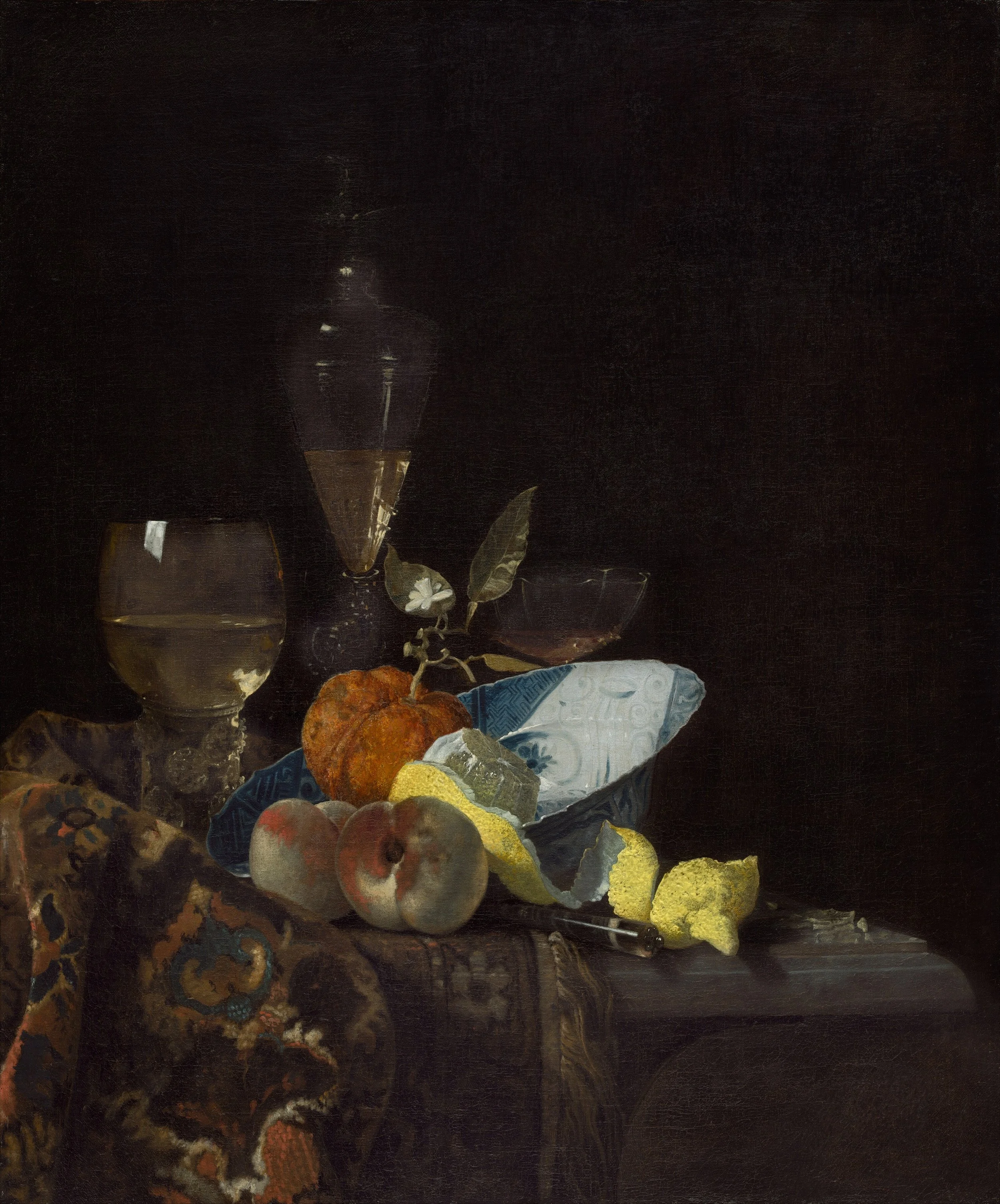
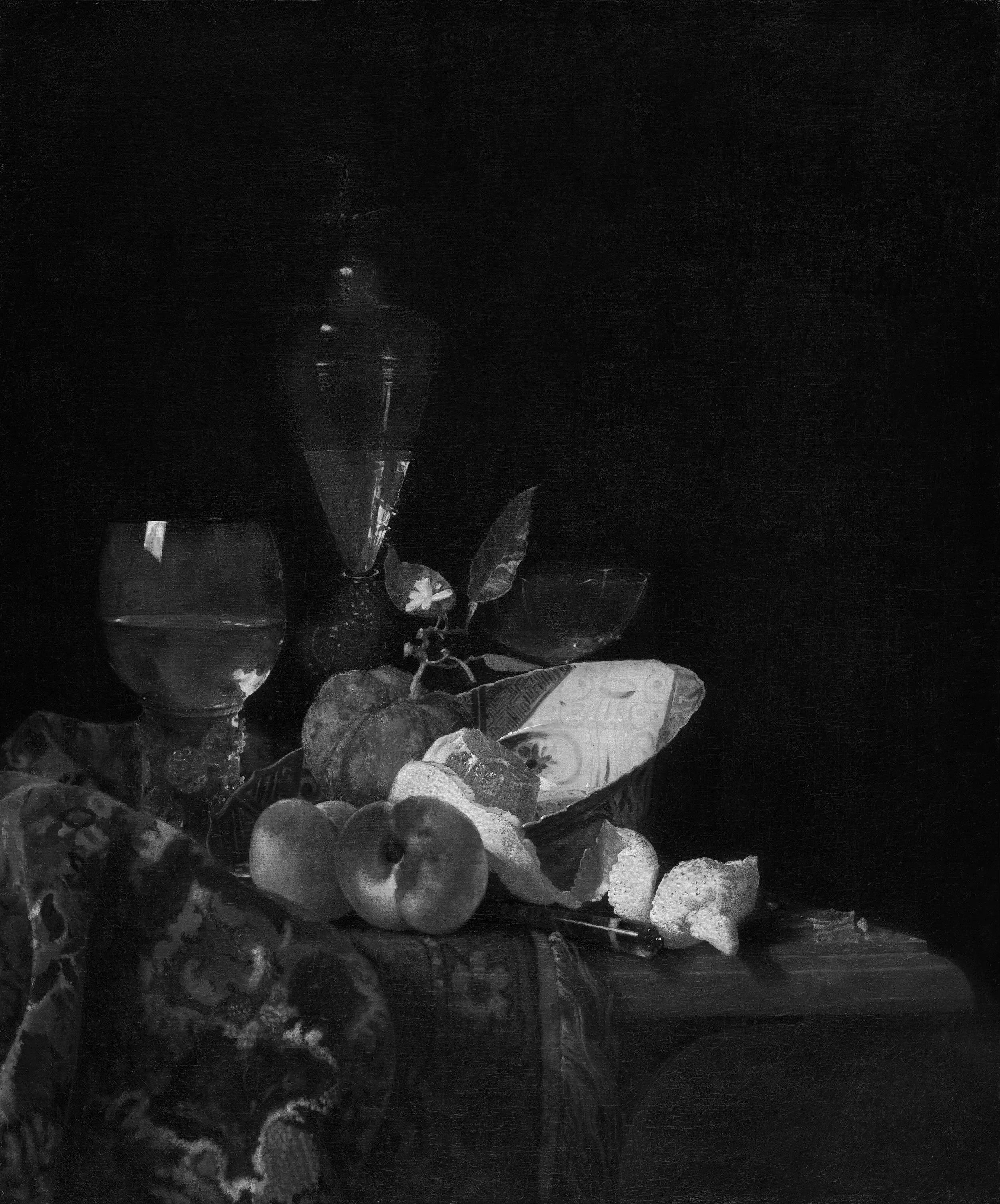
I have included a black and white version of the same image to make the value composition even clearer. Notice how much of the painting is dark and in shadow; the areas of light value take up just a small part of the picture plane. But, as a result of this, they shine and command our attention. The folded carpet in shadow is dark, and its pattern is painted with close values, so as not to attract to much attention. Contrast this with the light values in the painting: the lemons, the illuminated surface of the blue bowl, and the glass highlights. And just a quick word on color since I cannot resist: the colors on the carpet are also neutral and subdued in comparison to the bright, chromatic colors that we see in the illuminated region of the painting.
We also see this in Jan Vermeer’s The Lacemaker:
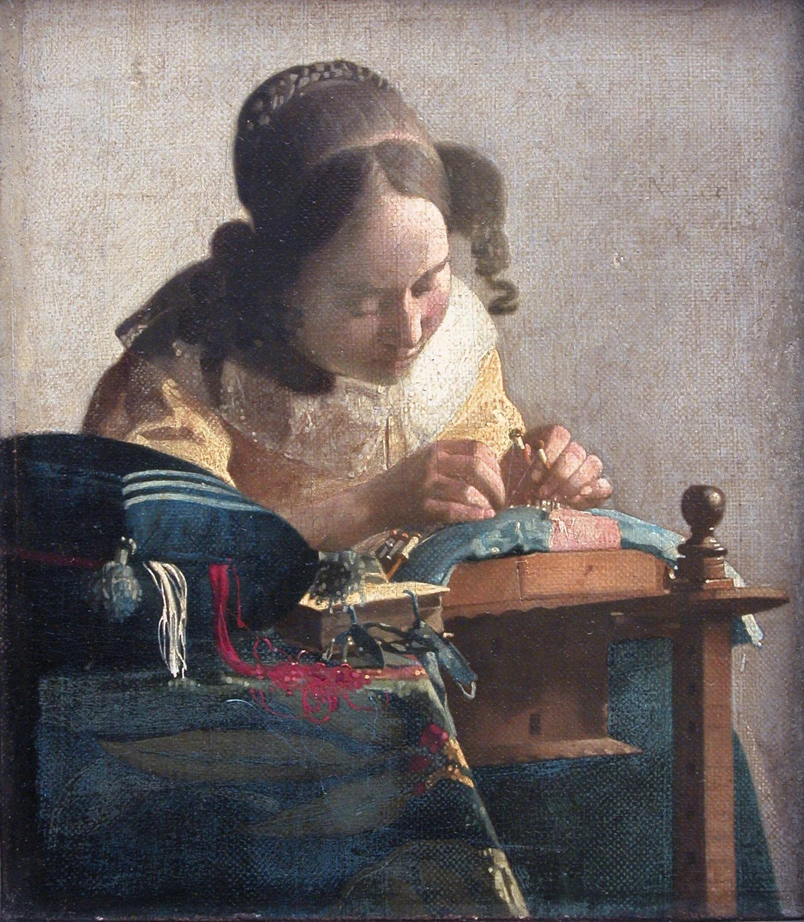
The Lacemaker, by Johannes Vermeer
Notice how the dark values merge in several places on left and bottom of the painting. The sitter’s hat merges with her hair; the dark blue pillow merges with the piece of furniture below it; and the sitter’s dress merges with the furniture. The merging of darks, as well as the decision not to overdevelop these areas (to be discussed in a later post) directs attention toward the sitter’s nimble fingers and lacemaking. In this way, Vermeer uses value massing both to simplify his composition and to direct attention to his focal point.
The Old Masters understood that a successful painting must be built upon a solid value structure. Accurate values relationships help to create the illusion of form, and the composition of values across the picture plane contributes to a painting’s visual interest. While “the vulgar” admire a painter’s use of color, a master painter recognizes that value is typically more important and sets the foundation for a compelling work of art.
In my next post, I will explore what contemporary painters can learn from the Old Masters regarding brushwork and paint handling.
Further Reading
Graham-Dixon, Andrew. Caravaggio: A Life Sacred and Profane. 1st American ed., W. W. Norton & Company, 2011.
Leonardo da Vinci. A Treatise on Painting. Translated by John Francis Rigaud, Dover Publications, 2005.
Poggioli, Sylvia. "Long Seen As Victim, 17th Century Italian Painter Emerges As Feminist Icon." NPR, 12 Dec. 2016, https://www.npr.org/sections/parallels/2016/12/12/504821139/long-seen-as-victim-17th-century-italian-painter-emerges-as-feminist-icon. Accessed 26 July 2026.
Uffizi Galleries. Judith Beheading Holofernes. Uffizi Galleries, https://www.uffizi.it/en/artworks/judith-beheading-holofernes. Accessed 26 July 2026.