A commonly heard refrain about the good life, expressed by both ordinary folk and theorists alike, is that we should spend our money on experiences, not things. Given that this seems so obvious to many, it has the air of being a platitude or truism. We should live each day to the fullest, making the most of our non-working hours by doing things in the world, not by spending our hard-earned money on whatever material baubles and gadgets the capitalist machine manipulates us into wanting. While this is largely sage advice, it overlooks the genuine contribution that certain material possessions can make to our well-being. In what follows, I will explain why at least some things, particularly those that are appreciated for their aesthetic value, can make a positive contribution to a person’s well-being. I will also show that, by cultivating aesthetic mindfulness, we can extend our satisfaction with such items and guard against hedonic adaptation.
I. Material Purchases and the Experiential Advantage
Research in behavioral economics suggests that people derive more satisfaction by spending their discretionary money on experiences (concerts, vacations, etc.) rather than things. In the field, this phenomenon has been dubbed the experiential advantage (Jacob C. Lee et al. 1031). Over the years, various explanations have been offered for why this is so. Thomas Gilovich and Amit Kumar have argued that while material possessions can bring us some immediate pleasure, we adapt to them more readily than we do experiential purchases. That is, such objects are particularly vulnerable to what behavioral economists refer to as hedonic adaptation (“A Wonderful Life” 153-154). Hedonic adaptation refers to the well-documented process by which we grow accustomed to events or stimuli that elicit a positive or negative emotional response, thereby returning to our original level of happiness. For example, a new car may give its owner an initial thrill, but all-too-soon become familiar and unremarkable. It will cease to spark joy. Gilovich and Kumar observe that material purchases are particularly prone to this process. They provide us with an initial hit of pleasure but soon fade into the familiar background of our lives; we no longer notice or appreciate them as we once did.
In addition to this, Gilovich and Kumar claim that experiential purchases bring us more satisfaction than do material possessions because they are more closely tied to our identity, or sense of self, and are less prone to social comparisons with others (152). While we may be dissatisfied with our new car if a friend or acquaintance one-ups us with a better or newer model, we would likely not be less satisfied with our beach vacation if a friend or acquaintance out does us with a better or longer vacation. People also enjoy sharing their experiences with others more than they do their material possessions. As a result of this, desirable experiences tend to solidify social bonds more than material purchases do. Finally, they show that people tend to derive more pleasure from anticipating desirable experiences than they do desirable material possession (“To Do or Have” 1).
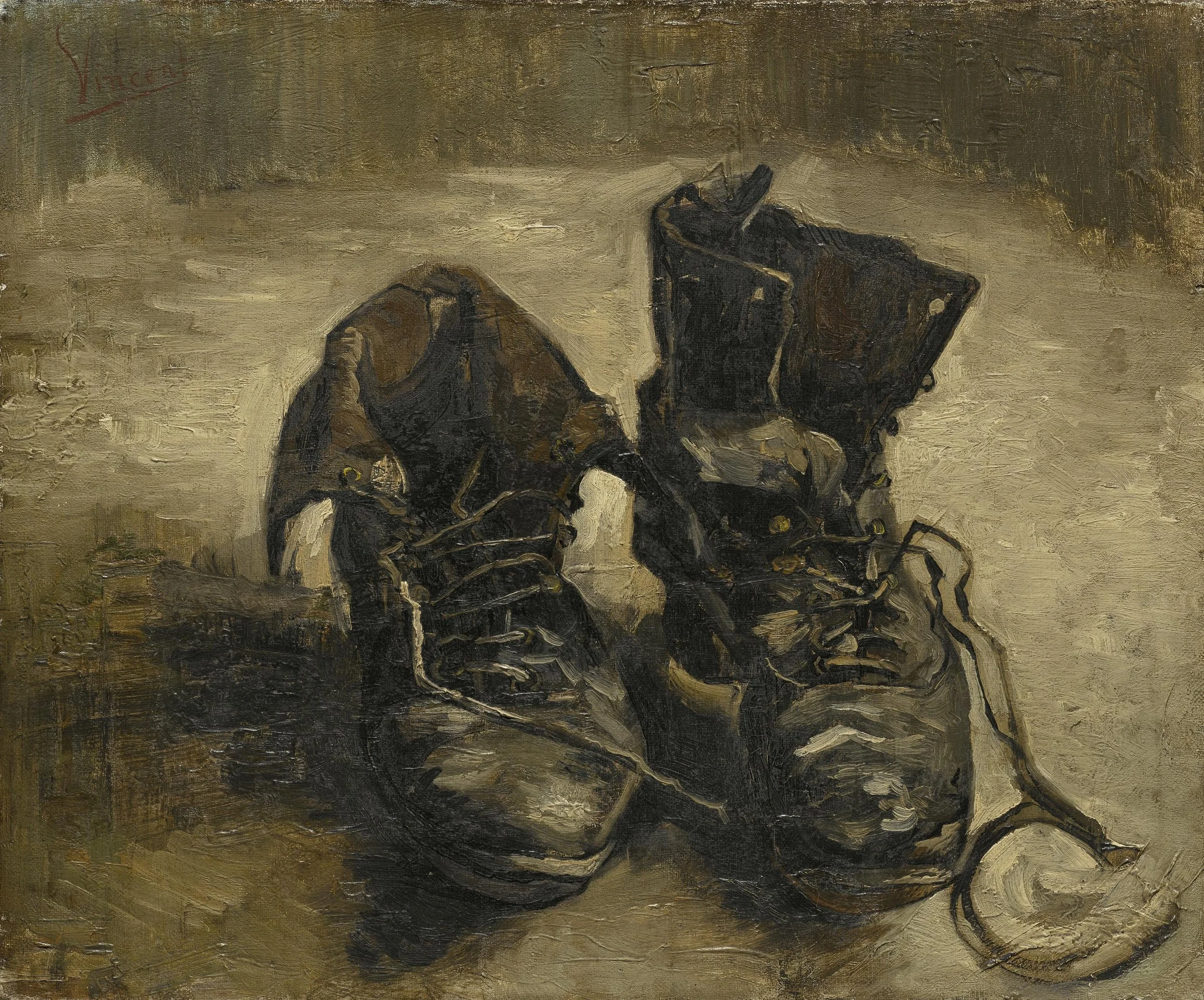
Now, it is important to note that much of this research is based upon survey data and self-reporting, i.e., asking people about how satisfied they are or were with various experiences. Given that people can misjudge their own happiness, and be influenced by how a question is framed, we may be somewhat skeptical of these findings. It is also the case, as Sasha Chapin has pointed out, that we don’t expect certain purchases to be particularly memorable or happiness-inducing at a single moment in time even though they provide us with considerable satisfaction in the long run. Chapin compares money spent on a lovely dinner at Chez Panisse with money spent on a nice pair of walking shoes. Clearly, the shoes will not provide us with a single, special memory in the way that the fancy restaurant meal will. But, as Chapin observes, they are not supposed to:
Shoes are supposed to offer a small but significant improvement to your life hundreds of times. They’re actually supposed to prevent the formation of memories, if they’re working properly – specifically, memories of sore feet or blisters.
Conceivably, this small but significant improvement of many sunny walks could dwarf the dinner in terms of overall enjoyment, but it certainly won’t be as memorable. Thus, the happiness granted by the shoes will be less apparent to the remembering self. Fortunately, though, the remembering self is not all there is to life. Most of life is lived in the unmemorable, in between moments: the kind of moments which well-chosen possessions (furniture, clothing, cooking equipment, nice soap) can improve.
After drawing this comparison, Chapin concludes that we should expect there to be a significant bias toward experiences when we are asked whether they make us happy. But we should not conclude from this that our responses reflect reality—that experiences really do make us happier than material possessions. Indeed, if the question were framed somewhat differently, and we were asked to reflect more fully upon the contributions that the shoes made to our happiness, we might choose the material possession (the shoes, in this case).
Other factors, such as social (economic) class, appear to influence one’s preference for experiential versus material purchases. Jacob C. Lee, Deborah L. Hall, and Wendy Wood show that whereas higher-class individuals reveal a preference for experiential purchases, lower-class individuals reveal a preference for material purchases. Given that they already have access to material and other resources, Lee et al. hypothesize that higher-class individuals can focus upon self-development, self-expression, and uniqueness. Lower-class individuals, in contrast, have fewer material goods and resources. As a result, they show more concern with the wise management of limited finances. They are made happier, or equally happy, by making material purchases than by making experiential purchases. Material purchases provide them with practical benefits and may retain their resale value (1031-1032).
The experiential advantage may also be affected by how materialistic a person happens to be. Not surprisingly, there is evidence that highly materialistic individuals derive less satisfaction from experiential purchases than non-materialistic individuals do. Indeed, some studies show that they are made equally happy by experiential and material purchases (J. W. Zhang, et al. 75). According to Jia Wei Zhang et al., this is because material buyers derive the same degree of identity expression through experiential and material purchases (78).
Research in behavioral economics aside, there seems to be a strong intuitive case for spending money on experiences versus things. We are often critical of those we judge to be materialistic, or unduly concerned with the accumulation of stuff. The priorities of such people seem to be in the wrong place. Instead of accumulating an abundance of worldly possessions, they should spend their time and money exploring the world and making new memories with family and friends. They should be living their lives, not wasting their hard-earned money on mass-produced junk. As minimalists since Henry David Thoreau have reminded us, we don’t buy things with money, but with hours of our lives [see note, 1]. Our time on Earth is limited and we ought not to waste it in the endless pursuit of material possessions. Indeed, one of the greatest regrets of the dying, as reported by long-time hospice nurse, Bonnie Ware, is having spent too much time at work and too little time with family and friends.
2. The Aesthetic Value of Material Possessions
While there is a strong case for prioritizing experiential over material purchases, there is much that it overlooks. In the first place, not everyone has an adventurous spirit and a desire to travel, go out, and explore; we are not all in search of experiences in the outer world. In Utilitarianism, John Stuart Mill observes that whereas some people are content with a lot of excitement and a little bit of tranquility, others are content with a lot of tranquility and very little excitement (13). The introvert, the recluse, and the bookworm may enjoy spending most of their time at home; home may be restorative and a source of joy. Being surrounded by their favorite things may bring such individuals immense satisfaction.
A plant lover may delight in tending to the many plants that bring beauty and fresh air to their home. Indeed, there is now evidence that caring for plants can bring with it several important mental and physical health benefits. And while caring for a plant is itself an activity, one that the plant lover enjoys, what often inspires a plant lover to buy a new plant is the sheer beauty of the plant itself, not any further utilitarian value that it might possess. Now, it might be objected here that plants are not mere things or material possessions; they are, instead, living beings. While this is true, we can think of them as things or material possessions for the purposes of this discussion insofar as they are bought and sold within the free market like other things or material possessions.
In addition to plants, people surround themselves with various other natural objects (with more obvious “thing” status) that bring them joy. The rock and mineral collector may pay for such things because their beautiful presence inspires happiness. The collector may feel happy and fulfilled by simply admiring nature’s astonishing creations. Indeed, the collector with a background in science, who understands the molecular structure of such objects, and how they are created, may stand in awe of them. They may have a deep and informed understanding of such objects that bolsters their aesthetic appreciation of them. If this is right, then there doesn’t seem to be anything hollow or frivolous about spending money on natural objects, such as rocks in minerals, that inspire awe or wonder. Indeed, we generally admire people who can appreciate the beauty of such natural objects.
We can find and appreciate the aesthetic value in non-natural objects as well. A collector of antique clocks may appreciate the artistry, design, and inner workings of the various examples in their collection. They may purchase, and come to cherish, a particular model that they have sought for many years. Like the rock and mineral collector, the antique clock afficionado may possess an intricate understanding of clocks—their mechanical structure, history, style, etc. This knowledge may enable them to notice and attend to the subtle details of the clocks in their collection, ultimately enhancing their aesthetic appreciation of them. And, of course, the history behind a given clock may imbue it with special meaning and significance.
It is also the case, as recognized in the field of behavioral economics, that many of the material objects that we buy enable us to participate in activities or enjoy them more fully; the boundary between things and experiences is sometimes fuzzy (Thomas Gilovich, et al., “A Wonderful Life” 153). For example, buying a tennis racquet may enable one to take lessons and meet up with a friend for a game. Still other purchases may contribute to our experiences in important but less obvious ways. Buying a new dress or suit for a special occasion, such as a wedding, may enhance one’s experience of the event. It may contribute to the event’s overall aesthetic quality, which may have been meticulously planned. Moreover, we have probably all had the experience of feeling underdressed or uncomfortable in our own clothes. Such feelings can make us self-conscious and distracted, thereby preventing us from being fully immersed in what we are doing. Wearing attractive, well-made clothing in which we feel comfortable can put our minds at ease and allow us to attend to the world around us and not to ourselves.
Similarly, a beautiful new set of handcrafted bowls may enhance and beautify one’s nightly dinners; they may be visually appealing and contribute to the aesthetic experience and ceremonial quality of the meal. If one were to invest in a set of bowls, perhaps commissioning a local artist to make them, then one could benefit from their use on a regular basis. Indeed, defenders of things, or material possessions, may point out here that such objects, unlike experiences, are permanent (or at least semi-permanent). Whereas vacations and concerts are temporary, the material possessions that we incorporate into our lives, if well-chosen, are lasting. A beloved coffee mug, for example, may bring one happiness every time that one use it for as long as it lasts, which could be years or a lifetime. The same may be true of the comfortable and stylish chair that one reclines in every night after dinner while reading a good book and enjoying a glass of wine, and the dark and artful cast iron pot that one steeps green tea leaves in after lunch. If we spend much our time at home, such objects may bring us immeasurable joy. Moreover, they may contribute to countless everyday aesthetic experiences that we otherwise wouldn’t enjoy, at least to the same extent. They can make the mundane appear special and suffuse our lives with an almost ceremonial quality and richness.
3. Everyday Aesthetics and Aesthetic Mindfulness
It is important to emphasize here that the objects that delight us in these ways are generally, although not always, well-chosen. I am not suggesting that we make mindless purchases and fill our homes—our lives— with clutter. Instead, I am claiming that purchasing high quality, well-chosen items can enhance our daily lives. We can, I think, find support for this view within the sub-field of aesthetics commonly referred to as everyday aesthetics. Proponents of everyday aesthetics, such as Yuriko Saito, call attention to the aesthetic value of everyday objects and experiences—objects and experiences whose aesthetic value has often been neglected. In Everyday Aesthetics, Saito explores the aesthetic value of food, gardening, the weather, the Japanese tea ceremony, and other experiences of everyday life. Others working in the field discuss the aesthetics of sport, perfume, personal grooming, and domestic scenes.
Proponents of everyday aesthetics note that, to appreciate an object or experience aesthetically, we must approach it with what we might refer to as aesthetic mindfulness. If we do not attend to the object or experience in the right way, we may fail to have an aesthetic experience. Minimally, appreciating something aesthetically requires that we pay attention to it. To see why this is so, compare a person who does, and another who does not, have an aesthetic experience while walking through a beautiful park on a fall day. The first person, or the one who has an aesthetic experience, absorbs the experience fully, attending to the cool autumn air on their face, the crisp leaves crunching underfoot, and the colorful crimson and gold leaves that fill the trees. In contrast, the person who does not have an aesthetic experience walks hastily through the park wearing headphones, distracted by what she is listening to on her phone. Importantly, the two cases differ in terms of the attention given to various objects or aspects of the environment. If we attend to our everyday environments, and are open to aesthetic experiences, then material possessions, of a certain sort, can enhance our daily lives and contribute to our happiness.
To be sure, as behavioral economists have observed, we often do adapt to the material objects that once impressed and inspired us. What we once admired for its unique beauty, design, or functionality, often fades into the background of everyday life. But this is not always the case and there are steps that we can take to keep our appreciation of such things alive. Drawing, again, from the field of everyday aesthetics, we can learn to keep our appreciation of such objects alive by attending to their aesthetic properties. We can become aesthetically mindful of our surroundings, thereby rendering ourselves receptive to opportunities for aesthetic appreciation. In some ways, aesthetic mindfulness, as I have described it here, resembles the kind of mindfulness that is practiced by certain spiritual traditions, such as Buddhism. Buddhist monk, Thich Nhat Hanh, believed that we can experience the world more fully by practicing mindfulness. In Peace Is Every Step, he illustrates how this is possible by describing the way that he and a group of children once enjoyed a basket of tangerines. He writes,
One day, I offered a number of children a basket filled with tangerines. The basket was passed around, and each child took one tangerine and put it in his or her palm. We each looked at our tangerine, and the children were invited to meditate on its origins. They saw not only their tangerine, but also its mother, the tangerine tree. With some guidance, they began to visualize the blossoms in the sunshine and in the rain. They saw petals falling down and the tiny fruit appear. The sunshine and the rain continued, and the tiny tangerine grew. Now someone has picked it, and the tangerine is here. After seeing this, each child was invited to peel the tangerine slowly, noticing the mist and the fragrance of the tangerine, and then bring it up to his or her mouth and have a mindful bite, in full awareness of the texture and taste of the fruit and the juice coming out. We ate slowly like that. (21-22)
After recounting this experience, he adds:
Each time you look at a tangerine, you can see deeply into it. You can see everything in the universe in one tangerine. When you peel it and smell it, it’s wonderful. You can take your time eating a tangerine and be very happy. (22)
As Naht Hanh observes, by practicing mindfulness, we can experience and appreciate a tangerine more fully. We can learn to attend to the properties of a tangerine that might otherwise go unnoticed and unappreciated. One important difference between mindfulness, in a general sense, and aesthetic mindfulness is that the latter is tied to the aesthetic point-of-view. Given its focus upon the aesthetic considerations, aesthetic mindfulness appears to be narrower in focus than the kind of mindfulness practiced within certain spiritual traditions, such as Buddhism. It is also not tied to the same set of theoretical or background beliefs as certain forms of spiritual mindfulness may be. Still, there is much overlap since most forms of mindfulness, such as the kind that Naht Hanh describes above, encourage us to attend more fully to the sensible properties of objects and the beauty of the world around us.
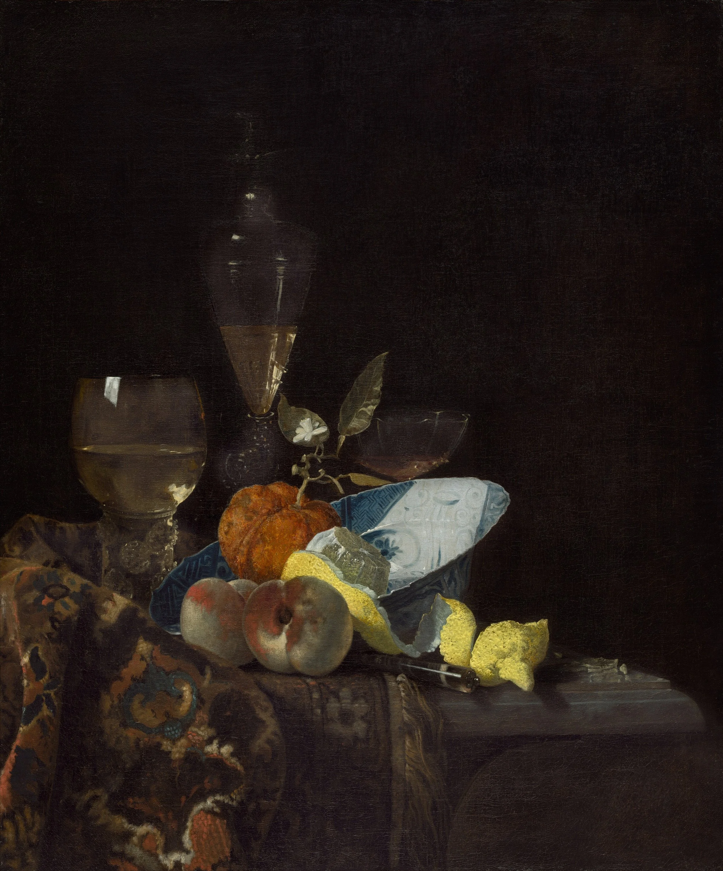
In a somewhat different context, Alain de Botton and John Armstrong argue that aesthetic attention can help us ward off adaptation in our romantic relationships. They believe that we can hone our aesthetic attention by, among other things, attending to still life paintings of everyday objects. Doing this encourages us to see and appreciate the remarkable in ordinary aspects of our own lives. Édouard Manet, for example, created an extraordinarily beautiful painting of a humdrum bundle of asparagus. His “tender portrait” calls attention to the “quiet charm of this edible flowering perennial.” Through his delicate brushwork, and sensitive rendering, Manet taught us to appreciate the beauty of this ordinary vegetable. As de Botton and Armstrong observe, where “we would just see a plain stalk, Manet noted and recorded subtle individuality, the particular hue and tonal variation of each frond.” By looking at his painting, we can learn to appreciate the beauty of this ordinary vegetable to which most of us have grown accustomed.
What is more, we can extend this lesson to the romantic domain and learn to see our lovers, who may no longer spark desire in us, in a new light. They write:
To rescue a long-term relationship from complacency, we might learn to effect on our spouse much the same imaginative transformation that Manet performed on his vegetables. We should try to locate the good and the beautiful beneath the layers of habit and routine. We may so often have seen our partner pushing a buggy, crossly berating the electricity company or returning home defeated from the workplace that we have forgotten the dimension in him or her that remains adventurous, impetuous, cheeky, intelligent and, above all else, worthy of love. (124)
One takeaway from everyday aesthetics is that we are surrounded by potential aesthetic experiences, if only we are attuned to them. Moreover, we can use the practice of aesthetic mindfulness as a buffer against hedonic adaptation in our everyday lives (where this includes our romantic relationships). By approaching the world through the lens of aesthetic mindfulness, we can enhance and extend our experiences of pleasure.
IV. Aesthetic, Material Purchases: Limitations
To be sure, we do not need to own closets full of fancy, material possessions to have aesthetic experiences. Indeed, it is widely recognized within the field of aesthetics that it is at least possible to approach most things from an aesthetic perspective and find some aesthetic value in them. Still, certain objects may affect us more profoundly than others and be more likely to produce in us an aesthetic response. Thus, as I have tried to show here, buying certain, well-chosen material possessions can increase our well-being by enriching our aesthetic lives.
It is also the case that people differ in terms of the degree to which they appreciate the aesthetic domain. Some people appear to be more aesthetically sensitive than others. We should expect those who are particularly sensitive to aesthetic considerations to derive more happiness from aesthetically motivated, material purchases than those who are not. Individuals with a low level of aesthetic sensitivity may not seek out formal aesthetic experiences, such as visits to an art gallery or concert hall. But they may also be oblivious or indifferent to style or fashion, care little about the aesthetics of what they eat, and purchase furniture based upon functionality and comfort alone.
Additionally, it is possible that possessing too many material possessions—collecting too much stuff – may serve as an impediment to aesthetic appreciation, for then one’s home—one’s life—may become cluttered and disorganized. As Marie Kondo has noted, we often need to purge our houses of much that we own before the truly beautiful items can shine. We should keep what, in her words, “sparks joy” and get rid of the rest. When it comes to aesthetic, material purchases, less may sometimes be more; quality may trump quantity. From an aesthetic perspective, it may be preferable to buy a single, original oil painting from a favorite artist than multiple, mass-produced prints from a retail chain, or to purchase a single well-made, designer cashmere sweater than four or five cheaply made knock offs from a fast fashion outlet.
We should also bear in mind that a preoccupation with material possessions can crowd out other things in life that matter. Now, most of us are in no position to collect an endless collection of well-made aesthetically pleasing objects. But, even if we could, it would not be advisable to do so. The value of aesthetically pleasing purchases should be balanced against other things that we value. Surely much else matters in life apart from the possession and admiration of beautiful objects. Moreover, one needs to reserve time in one’s life for enjoying what one has. A beautiful new set of gulf clubs will not be of much use if one is too preoccupied with online shopping—with acquiring the next beautiful thing – to enjoy them. Relatedly, we must acknowledge that shopping can be addictive, or nearly so, depending upon who you ask. We should do what we can to prevent ourselves from getting stuck on the hedonic treadmill, to the extent that this is possible. Clearly some of us would benefit from a shopping detox. At such times, the cultivation and exercise of aesthetic mindfulness can allow us to appreciate what we already have and to attend to the beauty and charm of our everyday surroundings.
In conclusion, material possessions or things can make an important contribution to our happiness and a life well lived. A person who is appreciative of things—even desiring more of them—need not be shallow and unduly materialistic. Instead, they may be particularly sensitive to their aesthetic value. For some people, some of the time, the purchase of a material object may bring with it greater joy than a single, short-lived experience, especially when the object in question is integrated into their regular routine or rituals. While hedonic adaptation can diminish the amount of happiness that objects bring us over time, cultivating aesthetic mindfulness can help us guard against habituation and appreciate what we already have.
Notes
[1] Thoreau never said that “we don’t by things with money, but with hours of our lives,” although these words are often falsely attributed to him. They are, however, inspired by something that he did say in Walden.
Works Cited
Chapin, Sasha. “Buying Experiences Probably Doesn’t Make You Happier than Buying Possessions.” Sasha’s Newsletter. https://sashachapin.substack.com/p/buying-experiences-probably-doesnt?utm_campaign=post&utm_medium=web. Accessed June 9, 2025.
De Botton, Alain and John Armstrong. Art as Therapy. Phaidon, 2013.
Mill, John Stuart Utilitarianism. Edited by George Sher. Hacket Publishing Company, 2002.
Gilovich, Thomas, et al. “A Wonderful Life: Experiential Consumption and the Pursuit of Happiness,” Journal of Consumer Psychology, vol. 25, no. 1, 2015, pp. 152-165.
Kondo, Marie. “6 Rules of Tidying.” KonMari. https://konmari.com/marie-kondo-rules-of-tidying-sparks-joy/?srsltid=AfmBOoqEsXe5_ZFuJ8WX_GZClIjZD0ThF0s3r7u6wFwG35-qUQBYfl_E#. Accessed June 9, 2025.
Kumar, Amit and Thomas Gilovich. “To Do or to Have, Now or Later? The Preferred Consumption Profiles of Material and Experiential Purchases,” Journal of Consumer Psychology, 2015, pp. 1-10.
Lee, Jacob C., Deborah L. Hall, and Wendy Wood. “Experiential or Material Purchases? Social Class Determines Purchase Happiness. Psychological Science, vol. 29, no. 7, 2018, pp. 1031-1039.
Nhat Hanh. Peace is Every Step. Edited by Arnold Kotler. Bantam Books, 1991.
Saito, Yuriko. Everyday Aesthetics. Oxford University Press, 2007.
Ware, Bonnie. “Regrets of the Dying.” Bonnie Ware. https://bronnieware.com/blog/regrets-of-the-dying/. Accessed June 9, 2025.
Zhang, Jia Wei, Ryan T. Howell, Peter A Caprariello, and Darwin A Guevarra. “Damned If They Do, Damned If They Don’t: Material Buyers Are Not Happier from Material or Experiential Consumption. Journal of Research in Personality. Vol. 50, 2014, pp. 71-83.